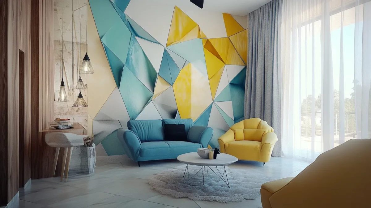
You chose the colour on a paint chip in the showroom. It looked perfect warm, sophisticated, exactly right. Then you painted the entire room and something felt off. The colour you selected appeared cooler, flatter, or even slightly different in hue compared to what you remembered. Sound familiar? This experience is shared by thousands of homeowners every year, and the culprit is almost always light. Understanding how lighting affects paint color is one of the most valuable pieces of knowledge you can carry into any painting project.
Why Light Is the Master Variable
Paint colour is not an absolute. What you see on a wall is not the colour of the pigment alone it is the colour of the pigment as filtered through the quality, direction, and temperature of the light hitting it. A paint color and lighting guide must therefore begin with understanding that light comes in many different types, and each type interacts with pigment in a fundamentally different way.

Natural Light: The Most Variable of All
Natural daylight changes constantly throughout the day, shifting from the cool blue-white of morning to the warm golden tones of late afternoon and the orange-red glow of dusk. This means that your wall paint color in different light conditions looks genuinely different at 8am, 1pm, and 6pm, not just slightly different, but sometimes radically so.
Cool-toned paints blues, greens with blue bases, greys can appear vibrant and accurate in strong midday light but shift to a deeper, more saturated tone in the warm late-afternoon light. Warm-toned paints yellows, oranges, warm whites can look almost luminous in golden afternoon light but appear flat or slightly greenish in the diffused light of a cloudy day. Knowing how lighting affects paint color under natural conditions is the first step in making a confident colour choice.
Artificial Light: Temperature Matters Enormously
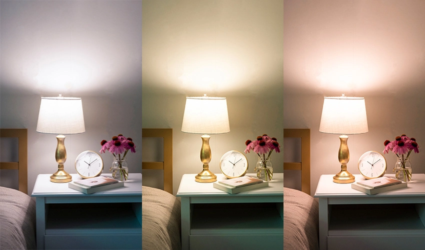
Artificial lighting is measured in degrees Kelvin (K), which indicates its colour temperature. This is perhaps the most critical variable in any paint color and lighting guide. Warm light (below 3000K) common in incandescent bulbs and warm LED settings amplifies yellow, orange, and red tones in paint while suppressing blues and greens. Cool light (above 4000K) common in fluorescent tubes and cool-white LEDs does the opposite, making blues and greens appear accurate and vivid while flattening warm tones.
The practical implication: a pale sage green that looks beautiful and botanical in natural light may take on a yellowish, almost olive cast under warm incandescent lighting. A warm cream might look perfect in the warm glow of table lamps but appear almost yellow under the harsh cool light of a fluorescent overhead fixture. Choosing paint color for room lighting means knowing what kind of artificial light your room uses before you commit to a shade.
Shadows, Angles, and Directional Light
Beyond the type and temperature of light, the direction from which light enters the room also affects wall paint color in different light situations. A wall that receives direct light will appear lighter and slightly washed out. A wall in shadow will appear darker and more saturated sometimes with a noticeably different hue than the lit wall of the same colour. This is why large rooms with multiple light sources can make the same paint appear to be several different colours simultaneously.
Practical Tips for Choosing Paint Color for Room Lighting
Always test paint colours on the actual wall surface and observe them at different times of day and under your artificial lighting. Paint a large swatch ideally 40 cm x 40 cm rather than relying on small chips. Observe the swatch in the morning, at midday, in the afternoon, and after dark under your lights.
If your room relies heavily on warm artificial lighting, choose wall colours that account for the warming effect you may need to go slightly cooler in the pot to achieve the warm, balanced result you want on the wall. If your room is lit by cool-white LEDs, warm tones will need a deeper base than you might expect to avoid looking washed out.
At Narandas & Sons, we can provide sample pots and expert guidance on how lighting affects paint color for your specific room conditions. Understanding the relationship between wall paint color in different light situations and the paint product itself is what separates a satisfying result from a disappointing one. Our team in Vadodara is here to help you get it right the first time.