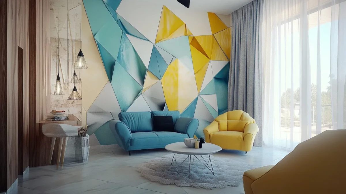
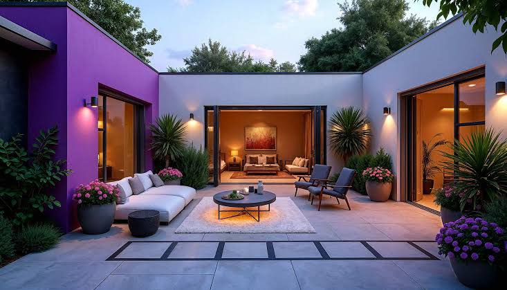
The boundary between indoor and outdoor living has softened dramatically in contemporary Indian home design. Open balconies connected to living rooms, covered verandahs that function as extensions of the interior, large glass doors that fold away entirely, and garden terraces that become dining spaces in the cooler months , all of these architectural choices create a visual and experiential connection between inside and out. When the paint colours on either side of that threshold clash or feel disconnected, the continuity of the space breaks down. Creating a seamless indoor outdoor paint palette India requires is one of the most rewarding and often overlooked aspects of home colour planning.
Why Indoor-Outdoor Colour Continuity Matters
Exterior interior paint coordination is not simply about aesthetics , though the visual result is undeniably beautiful. It is about creating a unified spatial experience that makes both the indoor and outdoor areas feel larger, more considered, and more intentional. When you look out from your living room through open doors onto a terrace or garden, and the exterior wall colour relates harmoniously to your interior palette, the visual journey is uninterrupted. The eye flows outward without a visual jolt, making both spaces feel more expansive.
Consistent paint theme home India increasingly values this flow , particularly in homes where the indoor-outdoor connection is a deliberate architectural feature. Paint color flow home design is the art of making colours move through a space the way water moves through connected pools , naturally, smoothly, and without abrupt interruption.
The Principles of Indoor Outdoor Color Scheme India
Start with the Connecting Space
Home colour scheme planning for indoor-outdoor continuity should always begin at the point of connection , the threshold. Whether that is a living room that opens onto a balcony or a kitchen that extends to a verandah, this connecting space sets the tone for both directions. The colours used here should be comfortable in both natural outdoor light and interior artificial light.
Use a Tonal Bridge
A tonal bridge is a colour that sits between the interior and exterior palettes , slightly warmer than the interior tone but lighter than the exterior finish. Coordinated home paint colors work best when there is at least one shared colour or tonal reference point that appears on both sides of the threshold. This could be a specific shade used on an interior feature wall that is echoed on the exterior facade, or a neutral tone used consistently across both.
Account for Light Differences
Indoor outdoor paint palette India must account for a fundamental challenge: exterior and interior surfaces are lit very differently. Colours look significantly different under direct sunlight than under interior lighting conditions. A colour that appears warm and rich indoors may look washed out and flat in bright outdoor sunlight. When selecting seamless interior exterior paint, always check your chosen shade in both indoor and outdoor light conditions before committing.
Practical Open Home Paint Palette Ideas
Here are some proven indoor outdoor living paint approaches for the Indian home:
- Earth tone family: Warm terracottas and sandy ochres on the exterior, transitioning to lighter clay and warm ivory tones inside. The connection is clear and the palette feels authentically rooted in the Indian landscape.
- Green continuum: Deep olive or forest green on the exterior, softening to sage or muted herb green inside. This connects the interior to the garden or green space beyond and creates a biophilic continuity.
- Warm neutral flow: Stone grey or warm taupe on the exterior, transitioning to a slightly lighter, warmer greige inside. Subtle, sophisticated, and universally successful.
- White and off-white bridge: A warm white exterior that transitions to ivory or cream inside creates the lightest and most versatile indoor outdoor color scheme India can use , particularly effective for homes with balconies and generous natural light.
Exterior Interior Paint Coordination: Product Considerations
An important practical note on seamless interior exterior paint: interior and exterior paints are very different products despite sometimes appearing similar in colour. Exterior paints contain UV stabilisers, greater weather resistance, and formulations designed for temperature extremes and moisture exposure. Interior paints are formulated for adhesion, low VOC content, and aesthetic refinement. You cannot simply use the same product inside and out , but you can colour-match across the two product ranges.
At Narandas & Sons, our team is experienced in helping homeowners plan coordinated home paint colors across interior and exterior surfaces. We can colour-coordinate across our full range of interior emulsions and exterior masonry paints to deliver the consistent paint theme home India’s most design-conscious homeowners are seeking. Visit us in Vadodara to start planning your seamless home palette.